IELTS Line Graph Band Nine Sample Answer
This question below is my band nine answer for a fairly famous task one question. Once you’ve finished, keep scrolling to find out why it would get a band nine and for some extra tips.
The graph below shows the population of India and China from the year 2000 to the present day with projections for growth to the year 2050.
Summarise the information by selecting and reporting the main features, and make comparisons where relevant.
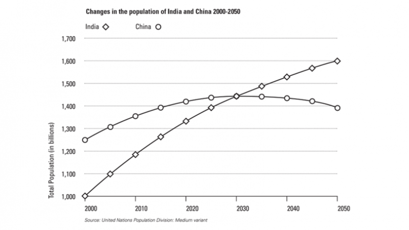
This graph demonstrates how the number of people in China and India have and will change over time. The graph starts with historical data going back to the year 2000 and continues with predictions up to 2050.
Overall, the population of India will overtake that of China in 2030 and continue to grow through to 2050. Meanwhile, China’s population will peak in the late 2020s before gradually declining.
At the beginning of the graph, in the year 2000, the population of China was 1.25 billion people. According to the graph, this has been growing and will continue to grow to a peak of just over 1.4 billion. After this time, the population will begin to steadily decline, reaching a low point of just under 1.4 billion by 2050.
On the other hand, the population of India has been increasing steadily since the year 2000 and will continue to grow into 2050. In the year 2000, the population of India was 1 billion, far lower than China’s. India’s population will overtake China’s in 2030 when both are just over 1.4 billion people. Its population will continue to grow to 1.6 billion in the year 2050, although this growth will become more gradual over time.
Why is this essay band nine?
At first glance, this looks like quite a hard line graph to write about. After all, you only have two lines to talk about, which means some test takers could run out of things to say. To make things worse, the tenses used to describe this graph are quite complex.
Using perfect continuous tense
When we want to describe something that has been happening non stop for an extended period of time and which are still happening now, we can use the present perfect continuous tense. We often use this tense with ‘for’ and ‘since’. For example:
- I have been living in London since 2020.
- They have been studying hard for the IELTS exam for a year.
- She has been watching that TV show for the last five hours.
To be honest, this is quite a rare tense, but it comes in handy for questions like this. In the essay, I’ve used it for:
- According to the graph, this has been growing and will continue to grow to a peak of just over 1.4 billion.
- On the other hand, the population of India has been increasing steadily since the year 2000 and will continue to grow into 2050.
For both of these sentences, I’ve combined the present continuous with the future tense. This is less clunky than something like ‘The population of India, has grown, is growing and will grow.’
Good Task One Structure
The structure of this answer is exactly how it should be. It has:
- An introduction telling you what the graph is about.
- An overview which gives the key points without going into detail or giving any numbers.
- Two body paragraphs both with a clearly defined topic.

